Installation
Getting Started
To install "Troika" theme you must have a working version of WordPress already installed. For information in regard to installing the WordPress platform, please see the WordPress Codex - http://codex.wordpress.org/Installing_WordPress
Update WordPress: To ensure a positive user experience, we highly recommend you update your WordPress to the latest stable version 3.8+. This will help to ensure that you are able to utilize all of the latest features of WordPress.
Extract the zipped package downloaded from ThemeForest to your desktop, in the extracted package you will find troika.zip file.
You can install the theme in two ways:
- via FTP: Extract troika.zip file and upload the extracted folder to /wp-content/themes/ folder on your server.
- via WordPress:
- Login to admin panel.
- Go to Appearance - Themes and click on the tab Install Themes. Choose upload.
- Click on Browse..., select the "troika.zip" and click in Install Now.
- After successfull installation click on Activate or go to Appearance - Themes and click on Activate to activate the newly installed theme.
- Next you will see a new menu item Appearance - Theme Options.
Theme Update
IMPORTANT: Backup your old theme folder. Download it to your computer locally.
You can upgrade the theme in a couple of ways:
Overwrite the entire theme folder
Extract troika.zip file and upload the extracted folder via FTP to /wp-content/themes/ folder on your server.
Re-upload via WordPress admin panel
Navigate to Appereance - Themes page. Activate a different theme. Delete previous version of Troika and re-upload the troika.zip file (refer to basic installation) downloaded from package.
What you start from
Now, you have installed and activated the theme 'Troika'. What's next?
The first thing you need to do is configure the parametres required, in the menu Appearance - Theme Options. There are quite a lot of them, but almost all of the parameters have default settings that will suit most of the users. Therefore, you can start with uploading a logo and favicon for your website, entering your personal data and saving the settings. All other parameters can be set up later on.
Homepage
Let's get to work with the homepage. If you want to get a page like on demo, you need to add the following set of shotcodes into page body:
[parallax id="24"]
	[next_event title='Next event in:' style='1' font_color='#fff']
	[line color='rgba(255,255,255,.4)' top='12' bottom='0' style='solid']
	[features cat='features']
[/parallax]
[events count='6' masonry="true" cols='3' switcher="true" title='Events']
[parallax id="72"][text_slider category='slider2'][/parallax]
[headline style='2']Free this weekend? Join us in church![/headline]
[headline style='4']We welcome visitors on Our Church and would
 love to have you join us in church this weekend.[/headline]
[thumbs]
	[thumb_item img_url='thumb_url' caption='Australia' link='#']
	[thumb_item img_url='thumb_url' caption='London' link='#']
	[thumb_item img_url='thumb_url' caption='South Africa' link='#']
	[thumb_item img_url='thumb_url' caption='New York' link='#']
	[thumb_item img_url='thumb_url' caption='Copenhagen' link='#']
	[thumb_item img_url='thumb_url' caption='Germany' link='#']
	[thumb_item img_url='thumb_url' caption='Amsterdam' link='#']
	[thumb_item img_url='thumb_url' caption='Paris' link='#']
	[thumb_item img_url='thumb_url' caption='Los Angeles' link='#']
	[thumb_item img_url='thumb_url' caption='Barcelona' link='#']
	[thumb_item img_url='thumb_url' caption='Stockholm' link='#']
	[thumb_item img_url='thumb_url' caption='Moscow' link='#']
[/thumbs]
[social]
Add the following code into Post Header:
[slider category="slider1" controls='pagination']
[gap][post_downloads cats='sermons'][/gap]
Blog
Now, you have finished up the appearance of the homepage of your website. It is time to start a blog.
To use the blog's functionality in our theme, you need create the blog stream page. To do this, you need to:
- Go to Pages under the WordPress menu and then click on Add New.
- Put your Title as usual ("Blog streampage" for example)
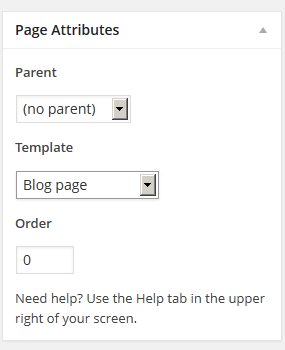
Choose "Blog streampage" as the page's template
- Publish this page.
Now assign the newly created page as "Posts page" (blog streampage). To do this:
Select the menu item Settings - Readings
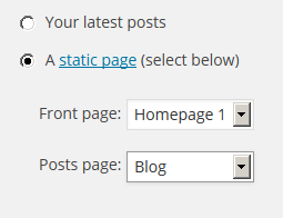
- In the field Front page displays select "A static page (select below)" , and in the list "Posts page:"choose the page you have created.
Blog Items
Now you can create blog posts.
- Go to Posts under the WordPress menu and then click on Add New.
- Put your Title as usual.
- Put Content if needed.
-
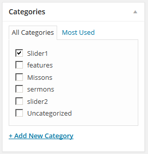
Select one or more categories to the Categories.
-
Select desired Post Format.
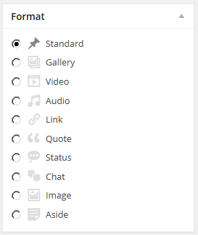
- Standard - just set the featured image or without featured image.
- Gallery - In the field Custom Post Format, please, add links to the pictures (or use Media manager). Every link must be inserted on the new line.
- Video - Insert link to the video (Youtube or Vimeo) in the field Custom Post Format.
- Audio - Insert link to the audio file in the field Custom Post Format.
- Quote - Add text of the quotes. In the field Title you can specify author of the quote. You can add link to the author's page by adding URL in the field Post Format URL.
- Link - Add a link to the Custom Post Format field.
- Status - Allows to use post as a status-message of the blog's author.
- Image - Displays only featured image and title of the post.
- Chat - Displays a quote from chat, e.g.:
<ul>
	<li><a href="#">user 1</a>
		<ul>
			<li>Lorem ipsum dolor sit amet, consectetur adipisicing elit, magna aliqua.</li>
		</ul>
	</li>
	<li><a href="#">user 2</a>
		<ul>
			<li>Ut enim ad minim veniam, quis nostrud exercitation ullamco laboris nisi ut aliquip</li>
		</ul>
	</li>
</ul>
- Aside - Displays text of the post.
For every post item it is needed to upload an image and to set it as a featured image. Click Set featured image on the right in the Featured Image section.
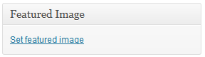
Click Select Files button and select image to upload (the full size image).
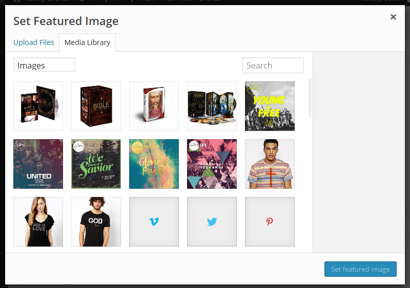
- After image was uploaded you need to set this image as featured. Click Use as featured image.
- Publish this post.
Gallery
Gallery - custom post type with special set of fields that allow to provide full information on the work done.
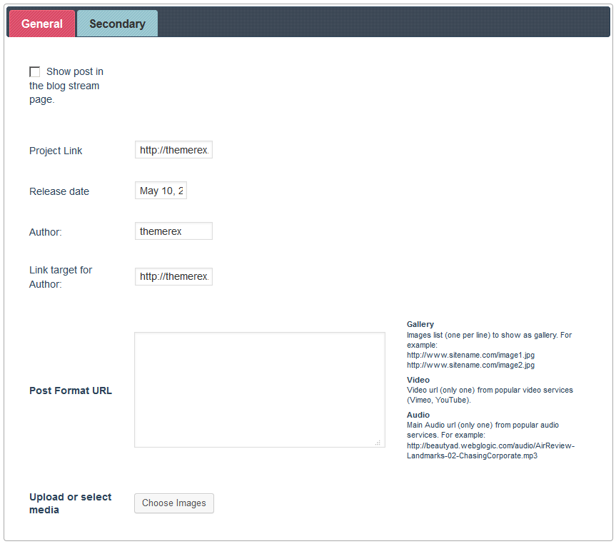
Gallery Options. General.
- Show post in the blog stream page. - this option allows to display gallery post in the blog stream page.
- Project Link - the link to be desplayed under post's text.
- Artwork by - an author of the gallery item.
- Link target for Artwork by - a link to the page of author of the project.
- Post Format URL - is used to add gallery or video to the post.
- Upload or select media - Allows to add contents into the field Post Format URL using Upload Manager.
Secondary
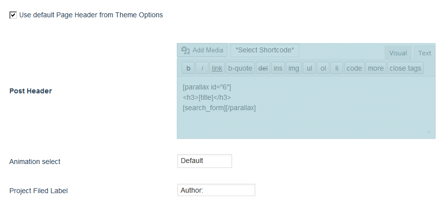
- Use default Page Header from Theme Options - if this field is ticked, the field Post Header will be ingnored.
- Post Header - allows to edit header of post.
- Animation select - select type of hover effect..
- Project Filed Label - Label of the project's author; it can be changed, e.g. into "directed by"or "created by".
Gallery Post Formats
To create a gallery inside the Gallery post, select the post format Gallery, and for video post, select the post-format Video. Other post-formats are not supported in the gallery.Parallax
Post type Parallax is used to create fullwidth-block, with parallax-effect. Upon saving Parallax post, you receive a shortcode. Just copy it and paste it in any place on your website. Between opening tag [parallax id=''] and closing one [/parallax] you may place any contents.Parallax Options
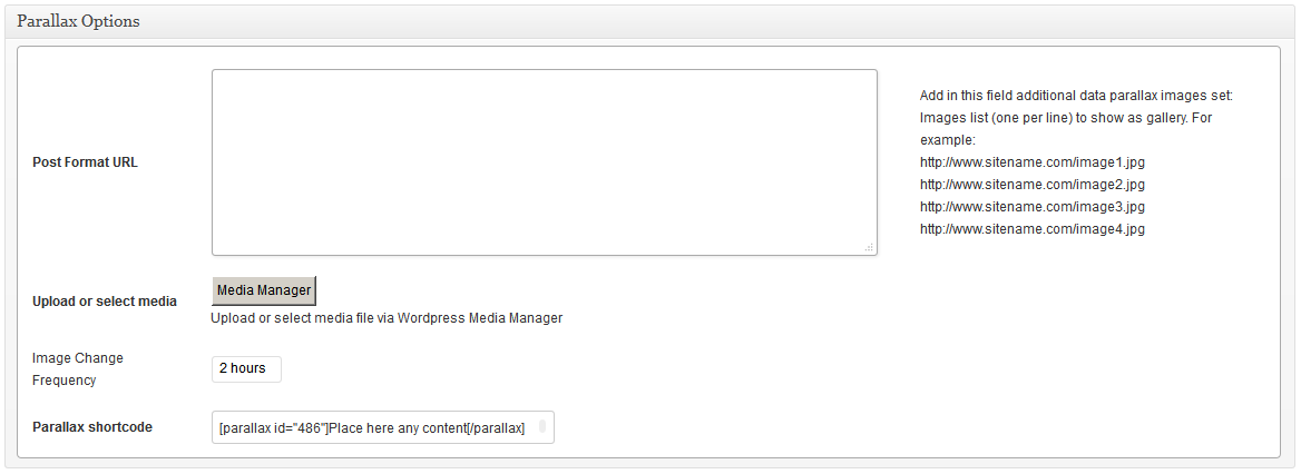
- Post Format URL - A field to insert gallery in parallax-block.
- Upload or select media - Use media manager to add pictures in parallax-block.
- Image Change Frequency - Selection of frequency of background image change.
- Parallax shortcode - copy and paste the shortcode generated in this field; add any contents between opening and closing tags.
Also, image gallery for background can be added in the field Post Content using Add Media -> Gallery.
If you want to design fullwidth-parallax block with one background image, you can use shortcode [gap][/gap]
Events
Please, install the plugin Events Calendar. After that, a new post type 'Events' will be available. This post type is used by shortcodes [events] and [next_event] .
Custom pages
Now we can prepare the other pages of our blog. This is not required, but if you want to change the display settings on Page 404, Archive pages or Search results - you have to create separate pages and customize them.
Consider the example of the Page 404. For pages Archive pages or Search results (if needed) configuration should be done the same way.
Page 404
Let's set up an error 404 page. To do this, you need to:
- Go to Pages under the WordPress menu and then click on Add New.
- Put your Title as usual ("Page 404" for example)
-
Choose "Page 404" as the page's template
- In "Page Options" area we set up the display of this page:
- Select Sidebar
- Show Sidebar
- Publish this page.
Archives
Archives Page Setup is similar to "Page 404"(see above)
Search results
Archives Search Results is similar to "Page 404"(see above)
Theme Options
General
Now, let's talk about the theme's settings: Appearance - Theme Options. Here you will get full control over display and functionality of the web-site.
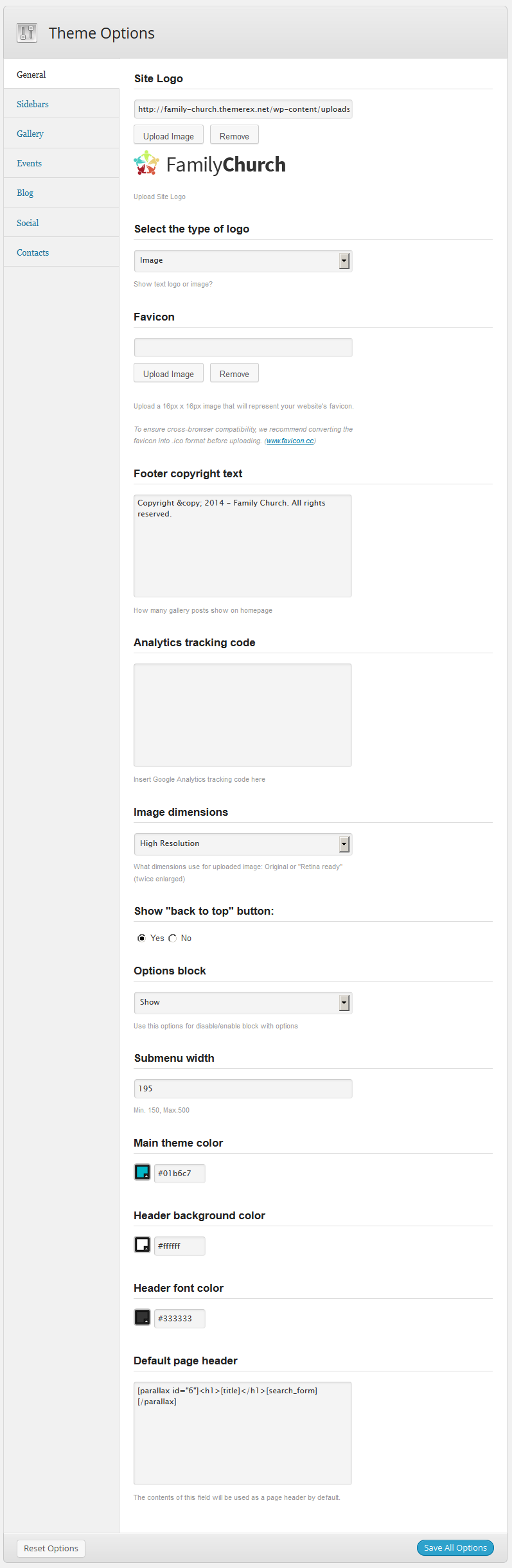
In this section you can set the following settings:
- Site Logo - in this field you can upload your logo.
- Select the type of logo - select the type of logo display - image or text.
- Favicon - In this field you can upload the icon to your website.
- Footer copyright text - In this field you need to enter any text to be displayed in footer.
- Analytics tracking code - In this field you can insert the code to monitor activity on your website.
- Image dimensions - Allows to choose quality of the pictures displayed on the website. Select High Resolution for correct image display on displays with high pixel density. To do this, you need to upload pictures twice bigger.
- Show "back to top" button: - Show or hide back to top button.
- Options block - Show or hide block with options.
- Submenu width - using this option you will be able to choose width of drop-down menu.
- Main theme color - set main accent color of the theme.
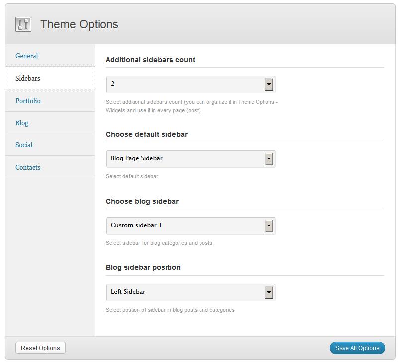
Sidebars
Here you can add and remove sidebars. You will be able to configure the widgets for the newly created sidebars in the menu Appearance - Widgets
Gallery
In this section theme options you can specify labels of fields for work description in portfolio, as well as select standard animation for portfolio posts.
- Label for field "Author" in gallery. - the post page Gallery in header displays information about the author. In this option you may specify any label you want to display,e.g. "Photo by" or"Artwork by".
- Choose default animation for gallery - selection of standard hover animation for posts of Gallery.
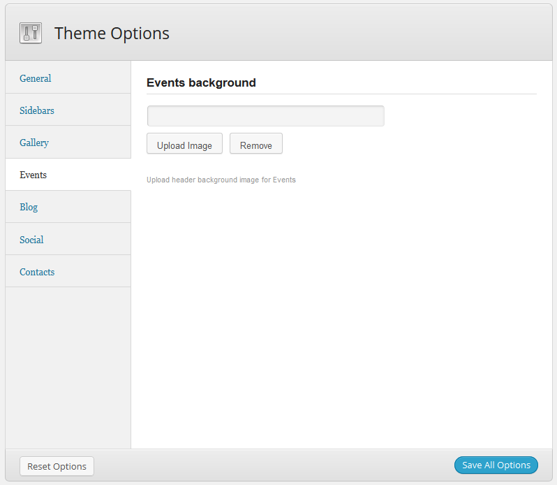
Events
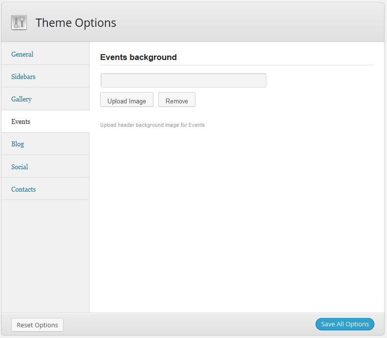
- Events background -- upload of the mage to be used as background on pages Events.
Blog
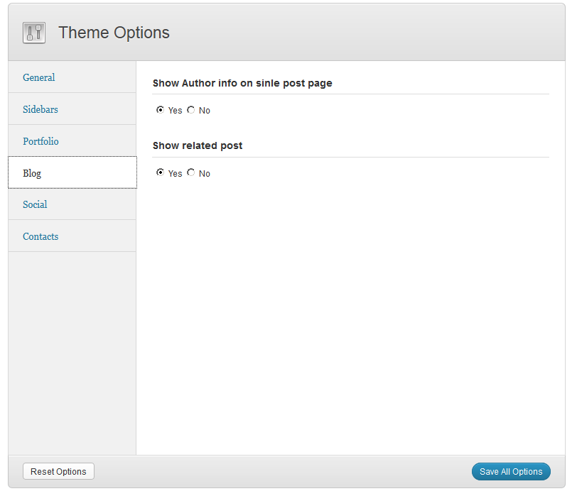
In this section you can switch display of the author's block and related posts on single page on and off.
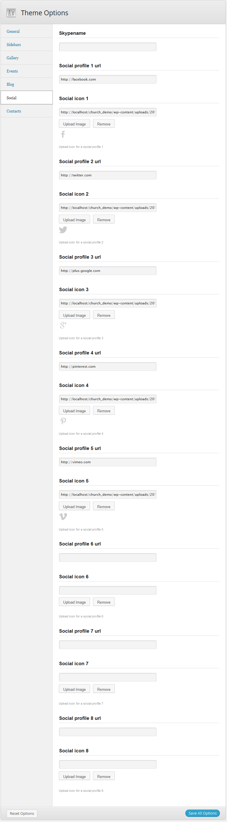
Social
Pick and download any social network icon, and specify URL of your profile. The list of your accounts in social networks can be displayed using shortcode [social].
Contacts
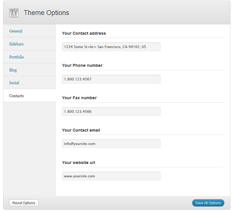
Contacts - section of Theme Options, where you can specify contact information. To display contact info, please use widget ThemeRex Contacts.
Widgets
- ThemeRex - Flickr photos -- used to display your pictures from Flickr.
- ThemeRex - Contacts -- used to display your contact info.
- Follow Me -- used to display the list of your accounts in social networks.
- Popular -- used to display popular posts. The first tab puts out posts in order by number of views, the second tab - by number of comments.
Shortcodes
Shortcodes are a cool feature in WordPress that essentially allows you to do some pretty incredible things by just inserting a shortcode into a page or post. Using Shortcodes is a breeze, just insert one where you want the relevant content to show up.
The theme comes pre-packed with a number of shortcodes allowing you to add the info easier.
IMPORTANT: Please make sure to always start new shortcodes on new lines. Most of the time you wont encounter any errors if you don't do that but unfortunately WordPress does mess up the html sometimes. This is true for all shortcodes, but the inline ones like highlight, those are the only ones that don't need a new paragraph.
Here's a list of the shortcodes included in troika theme:
Headline
Shortcode [headline] is used to create headings (h1-h6).
The shortcode has the following set of parameters:
- style --Heading style. Available options - from 1 to 6.
- top -- top margin.
- bottom -- bottom margin.
Example:
[headline style='1' top='50' bottom='30']Section title[/hedline]
Gallery
Shortcode [trex_gallery] is used to put out gallery posts in isotope-filter.
Shortcode parameters:
- count -- the number of posts to be displayed. If the number of posts displayed is less than general number of posts gallery, under the block there will be a button Load More. Value by default is 2.
- cat -- slug or id of the category gallery.
- cols -- number of columns. Available variants from 2 to 4. Value by default is 3.
- switcher -- switches the display of drop-down list with the number of columns on. Set 'true', if you want to display switcher of number of columns.
- hover -- set hover effect different from default.
Example:
[trex_gallery count='3' switcher='true' title='Our Gallery' cols='3' cat='gallery_1']
Events
Shortcode [events] puts out events from isotpe-filter.
Shortcode parameter:
- count -- number of posts to be displayed. If the number of posts displayed is less than general number of events, under the block there will be a button Load More. Value by default is 2..
- cat --slug or id of the category gallery
- cols -- number of columns. Available variants from 2 to 4. Value by default is 3.
- switcher --switches the display of drop-down list with the number of columns on. Set 'true', if you want to display switcher of number of columns.
- masonry -- If you set "true", posts will be put out in the layout masonry. Value by default is "true". To display posts with pictures of the same height, you need to set 'false' in the parameter masonry.
- title -- title of the block.
- upcoming -- show only upcoming events.
Example:
[events masonry='false' count='3' switcher='true' title='Latest events' cols='3' cat='church_events']
Line
Shortcode [line] is used to create horizontal lines of different styles, color, and width.
Parameters available:
- id -- sets id, in case in you need it, e.g. to use in JS.
- style -- sets the line's style:dotted, dashed, solid, double, groove, ridge, inset, outset.
- color -- hex-code of the line's color (#ff0000).
- width -- the length of the line in pixels. If you want the line stretched to the entire width, do not specify this parameter or specify -1.
- height -- Line height in pixels. Default - 1px.
- top -- top margin.
- bottom -- bottom margin.
Example:
[line style='solid' height='2' color='#000000' top='30' bottom='30']
Infobox
Shortcode [infobox] is used to create information blocks.
Parameters available:
- id -- allows to set block's id if needed.
- style -- style (type) of the informational block. available variants: regular, info, success, error.
- static -- if it's set "0" in the parameter, infobox will be closing by click.
Example:
[infobox static='1' style='regular'][/infobox]
Highlight
Shortcode [highlight] is used to highlight text's fragments in order to draw attention.
Parameters available:
- id -- sets ID for the cover (optional).
- color -- color of the text
- bg -- color of the background
Example:
[highlight id='any_id' color='#000000' bg='#ffc000']
Image
Shortocode [image] is used to put out a picture with parameters of wrapping.
Parameters available:
- id -- sets ID for the cover (optional).
- src -- address for the picture
- title -- title (caption)
- align -- which side the text will wrap the image from: 'left' or 'right'
- width -- width of the picture
- height -- height of the picture
Example:
[image align='left' src='img_url.jpg' width='300' height='150' align='left']
Quote
Shortcode [quote] is used to insert a block with a quote.
Parameters available:
- id -- sets ID for the cover (optional).
- fontsize -- font size in pxls.
Example:
[quote id='quote_id' fontsize='22']
Tooltip
Shortcode [tooltip] is used for pop-up tips in the text.
Parameters available
- id -- sets ID for the cover (optional)..
- title -- the text in the pop-up tip.
Example:
[tooltip title='tooltip example']Lorem ipsum site dolor amet[/tooltip]
Dropcap
Shortcode [dropcap] is used to create drop cap.
Parameters available:
- id -- sets ID for the cover (optional).
- style --drop cap style. Variants available - 1 и 2.
- letters -- if you need to allocate more than one letter, you can set number of letters in this parameter.
Example:
[dropcap style='2']Lorem ipsum sit dolor amet.[/dropcap]
Audio
Shortcode [audio] is used to insert audio to the page or post.
Parameters available:
- id -- sets ID for the cover (optional).
- url -- the link to the video file.
- title -- title of the audiofile
- author -- name of the author/performer of the audiofile
Example:
[audio url='audio_url.mp3' author='Artist' title='Song Name']
Video
Shortcode [video] -- is used to insert video to the page or text of the post.
Parameters available:
- id -- sets ID for the cover (optional).
- url -- the link to the video (youtube or vimeo)
- width -- width of the video
- height -- height of the video
- bg_img -- preview image clicking on which the video starts reproducing
- title --title that is put out under the block with the video.
Example:
[video url='http://youtube.com/?q=video_code' width='620' height='350' bg_img='img_url.jpg' title='video example']
Columns
Shortcode [columns] is used to build column layouts.
Parameters available:
- id -- sets ID for the cover (optional).
- count -- general number of columns.
- top --top margin
- bottom -- bottom margin
- left -- left margin
- right -- right margin
Example:
[columns count='2']
	[column_item]Aenean quis enim et felis malesuada faucibus egestas sit amet nulla.[/column_item]
	[column_item]Cum sociis natoque penatibus et magnis dis parturient montes, nascetur ridiculus mus.[/column_item]
[/columns]
List
Shortcode [list] is used to create lists.
Parameters available:
- id -- sets ID for the cover (optional).
- type -- list type: icon - next to each item in the list an icon will be displayed , default - to display standard list.
- icon -- icon class. Full list of icons with classes available here.
- top -- top margin
- bottom -- left margin
The class will be unique for each item in the list, for example:
[list_item icon='icon-class']
Example:
[list type='icon' icon='icon-right-open']
	[list_item]Lorem ipsum[/list_item]
	[list_item icon='icon-left-open']Sit Dolor[/list_item]
[/list]
Tabs
Shortcode [tabs] is used to create block with tabs:
Parameters available:
- id -- sets ID for the cover (optional).
- tab_names -- names of tabs, separated by "|", e.g.: "tab1|tab2|tab3"
- initial -- which of the tabs will be displayed by default. The number should be less than total of number of tabs.
Example:
[tabs tab_names='tab1|tab2|tab3']
	[tab]Tab 1 Content[/tab]
	[tab]Tab 2 Content[/tab]
	[tab]Tab 3 Content[/tab]
[tabs]
Accordion
Shortcode [accordion] creates blocks of the "accordion" type . Attention: at the same time only one of the blocks can be open.
Parameters available:
- id -- sets ID for the cover (optional).
- initial - (number). The number of the initially open block (from 1 to the number of blocks). Attention: if you want make so, that all accordion item are closed initially - write parameter initial greatest, than items count!
Example:
[accordion initial='2']
	[accordion_item]Lorem ipsum[/accordion_item]
	[accordion_item]Sit Dolor[/accordion_item]
[/accordion]
Toggles
Shortcode [toggles] creates blocks of the "toggles" type . Comparing to the "accordion" you can close all the blocks or open more than one.
parameters available:
- id -- sets ID for the cover (optional).
- initial - (number). The number of the initially open block (from 1 to the number of blocks). Attention: if you want make so, that all toggle items are closed initially - write parameter initial greatest, than items count!
Example:
[toggles initial='2']
	[toggles_item]Lorem ipsum[/toggles_item]
	[toggles_item]Sit Dolor[/toggles_item]
[/toggles]
Table
Displays the table
[table]
	Paste here table content, generated on one of many public internet resources, for example:
	http://html-tables.com/
	or http://tablegen.nfshost.com/
	or http://www.impressivewebs.com/html-table-code-generator/
[/table]
Googlemap
Shortcode [googlemap] displays Google map at the address you specified.
Parameters available:
- id -- mandatory parameter, it is required to specify a unique ID.
- widht -- (number). Map frame width (in pixels or percents)
- height -- (number). Map frame height (in pixels)
- address -- address of the place that you want to place in the center of the map
Example:
[googlemap width='360px' height='100' address='NY, USA' id='unique_id']
Gap
Adds fullwidth-page gap, for pages without sidebar.
Parameters available:
- id -- unique ID of the block.
- bg_img -- URL of background picture.
- parallax -- true, if you want to use Parallax effect int he background block.
Example:
[gap bg_img='bg_img_url.jpg' parallax='true' id='gap_id']Any Content[/gap]
Title
Shortcode [title] is used to display title of the current page.
Example:
<h1>[title]</h1>
Contact Form
Shortcode [contact_form] is used to put out contact form.
Parameters available:
- id -- sets ID for the cover (optional).
- title -- title for the contact form.
Example:
[contact_form id='site_contact_form' title='Contacts']
Slider
Shortcode [slider] is used to put out slider block.
- category --category of posts to display in the slider.
- count --number of displayed slides.
- ids -- optionally you can specify id's of slides separated by a comma. If you use the ids, parameters category will be ignored.
- gallery -- switches the mode 'gallery': it is only a pitcture that is displayed, text on the slide is not putout.
- controls -- switches on / off and lets you choose the type of slider controls.
- 'true' -- swithces the display of direction navigation and pagination on.
- 'arrows' -- only direction navigation
- 'pagination' -- only pagination
- 'false' -- skip slider controls.
- slide_width -- width of slides.
- slide_height -- height of slides.
- title -- title of the slider. Displayed under the slider block.
Example:
[slider category='slider1' slide_width='960' slide_height='500' controls='true']
You can also use nested shortcodes [slider_item].
Parameters available:
- src -- src of the picture.
Example:
[slider slide_width='500' slide_height='300']
	[slider_item src='image1_url.jpg']
	[slider_item src='image2_url.jpg']
[/slider]
Features
Shortcode [features] is used to display features-block and post groups of the specified category.
Parameters available:
- cat -- category of posts.
- count -- number of posts.
- title -- title of block.
- ids -- optionally you can specify id's of posts separated by a comma. If you use the ids, parameters cat will be ignored.
Example:
[features ids='192,193,202' title='Features']
Text Slider
Shortcode [text_slider] used to display text slider.Images attached to the post will not be displayed. If you want to create a slider with pictures - you may use shortcode[slider].
Parameters available:
- category -- category of posts to be displayed in the slider.
- title -- title of the block displayed above the slider.
- ids -- optionally you can specify id's of slides separated by a comma. If you use the ids, parameters 'category' will be ignored.
- count -- кол-во слайдов.
Example:
[text_slider category='slider2' count='3']
Team
Shortcode [team] displays the members of your team (photo with description).
Parameters available:
- id -- sets ID for the cover (optional).
Example:
[team id='our_team']
	[team_item user='user_login1']
	[team_item user='user_login2']
	[team_item user='user_login3']
[/team]
Skills
Shortcode [skills] blocks used to build blocks with list of skills. There are two display options: radial chart with legend and a bar chart.
Parameters available:
- style -- diagram type: radial or bar.
- title -- block's title
- size -- used for the pie chart - diameter of the circle in pixels.
To buildt the chart elements, you must use the shortcode [skills_item].
Available options of nested shortcode:
- title -- the name of the chart element
- level --skill level as a percentage
- color -- color of the column of diagram sector
Example:
[skills style='radial' title='Language Skills' size='256']
	[skills_item title='Item Title' level='30' color='#ff0000']
	[skills_item title='Item Title 2' level='40' color='#ffC000']
	[skills_item title='Item Title 3' level='30' color='#C0C3C0']
[/skills]
Next Event
Shortcode [next_event] is used to put out the the countdown to the last event.
Parameters available:
- font_color -- color of the text.
- title -- title of the counter block.
- style -- style of the counter: 1 or 2.
- cat -- slug or id of the category.
Example:
[next_event title='Next Event:' font_color='#fff' style='2' cat='any_cat_slug_or_id']
Post Downloads
Shortcode [post_downloads] used to put out the latest post of the category you have set with the links for download of attached files.
Parameters used:
- id -- sets ID for the cover (optional).
- cats -- slug or id of the category.
Example:
[post_downloads id='sermon_id' cats='sermons']
Thumbs
Shortcode [thumbs] is used to putout picture with caption.
Embedded shortcode [thumb_item] has following set of parameters:
- img_url -- a link to the picture.
- caption -- text of the caption, HTML-tags can be used.
- link -- url of the link.
Example:
[thumbs]
	[thumb_item img_url='img_url.jpg' caption='Caption text' link='#']
	[thumb_item img_url='img_url2.jpg' caption='Caption text 2' link='#']
[/thumbs]
Search Form
Shortcode [search_form] is used to put out search from.
Example:
[search_form]
Wrapper
Shortcode [wrapper] is used to create sections with margins and titles, where any content can be placed.
Parameters available:
- indents -- size of margins in pxls.
- title -- title of the block.
- min_height -- minimum height of the block in pxls.
Example:
[wrapper title='Wrapper Title' indents='30' min_height='500']Any block content[/wrapper]
Woocommerce
Please, download the plugin Woocommerce from the official website repository and upload it to the folder ' wp-content/plugins' using FTP-client. Or, you may use WordPress menu to install plugins (Plugins -> Add New).PSD Files
We've included 21 PSD files with this theme. All PSD files you can find in the folder PSD
Demo Content
IMPORTANT: Please, note! Before you install demo-content, Woocommerce must be installed.
We've included 3 XML files for different topics: demo_content_church.xml, demo_content_charity.xml and demo_content_politics.xml with content from our demo site that you can find in DemoContent folder inside the archive that you have downloaded from ThemeForest.
To import this information into a WordPress site follow these steps:
- Log in to that site as an administrator.
- Go to Tools: Import in the WordPress admin panel.
- Install the "WordPress" importer from the list.
- Activate & Run Importer.
- Upload the file "Content.xml" file using the form provided on that page.
- You will first be asked to map the authors in this export file to users on the site. For each author, you may choose to map to an existing user on the site or to create a new user.
- WordPress will then import each of the posts, pages, comments, categories, etc. contained in this file into your site.
Sources and Credits
This section discloses the sources of various files used within the theme and describes their function. Use this section to gain an understanding on how the theme functions behind the scenes if considering any type of modification.
- Fonts:
- Raleway (non standard)
- Fontello (non standard, icons set)
- Arial (standard)
All non standard fonts are from Google Web Fonts and Fontello icons set
We have used the pictures from:
http://www.bigstockphoto.com/
All images are copyrighted to their respective owners and not available for download with this theme.